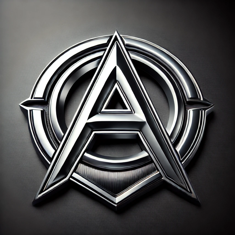
In this weeks, blog, post and creative exercise I decided on doing an activity that I found in a book from class called Caffeine for the Creative Mind by Stefan Mumaw and Wendy Lee Oldfield. The creative exercise was called, Don’t Put This on Your Hood Though. For this exercise you must create a car emblem for yourself. It can have something to do with your name, your initials, or a nickname or anything that says who you are. The only catch is to remember that it has to look cool in chrome.
Thought’s

Challenges
The first challenge that I encountered in this exercise was how was I going to incorporate colors, shapes or even text in my design? What will it say if I did use text? I first started with my sketch book and tried a few different approaches including shapes and incorporating colors and text.

Success
Finally I decided to create an emblem with text because I thought that it personally would look better in chrome if it was just as simple as a letter or two. I also decided to include some shape into my emblem, to mask the letter text and give it some type of background. When I
decided on my font I wanted to make sure it was clear and bold so that it could be seen and recognized from a distance. I had a lot of fun with this creative exercise, it even had me looking at the different emblems out in the world from different cars as I would be out doing my daily routine.


No comments:
Post a Comment