Saturday, September 28, 2024

Design Blog Post 4

    In this week's Design Blog I was tasked with creating a complete movie poster for an upcoming Halloween/Scary Movie.The specs for this project required 24in by 36 in at 150 dpi. This project was really fun and exciting especially with the holidays around the corner. Although I had some hiccups along the way.


Thought’s


    My first thought was to try and gather as much research on what horror movies were planned to be released in the upcoming months. After going through a long list of films expecting to be released in the near future, one stood out the most to me and it was a sequel of a film franchise I was very interested in called ‘The Conjuring’. I also decided on doing a movie poster on this film because I was somewhat familiar with the storylines and characters in the movie. My next step was to research about the upcoming film being The Conjuring 4. I need to know what characters the film planned to use and a brief description of the film. What helped me out  to develop my movie poster was that there was already a trailer for the film giving me key information on what the movie would be about and what I could include in my movie cover. 


Challenges


    I feel that in this project although fun was yet the most challenging for me when it came to developing. Challenges I faced included image quality, typography, color palette, concept development and most of all trends and originality. Originality was very important to me in this piece because this movie poster was based on an actual film franchise so I wanted to keep everything in my movie cover somewhat relevant and not steer too much off topic although I only had a mere spec of information to work off. I found tons of images I could have incorporated into this project but I repeatedly ran into the same problems of Image Quality. When I would download the image off the web and open it in photoshop it would be pixelated. Another challenge I made a priority was Typography. 


Success


    Overall I decided that the typeface I was looking to use was going to be one of the main key factors in my project. Once I researched other movie covers I noticed that typeface and text was very limited to the movie cover of the other sequels. After seeing how the other movie covers had basic but important information I noticed that my developing movie poster was too busy. I had the poster way to flutter with too much text and for me that took away from my intended message. I wanted to make my poster to be scary yet informative but still mysterious therefore attracting my target audience. Overall I was satisfied with my final project because I wanted to keep some originality of the previous films. 


Thursday, September 26, 2024

Project 4b


Project Name
: The Conjuring 4


Name of Client: Warner Bros. Entertainment 


Project Requirements: 24 in x 36 in at 150 dpi


Target Audience: Horror fans who enjoy supernatural horror and thriller films. Young adults typically between the ages of 18 and 35,since they are often drawn to contemporary horror. Fans of the franchise who have followed the conjuring universe, including some spin offs like Annabelle and The Nun movies. Paranormal enthusiasts and casual moviegoers looking to engage in a cinematic experience during halloween.  

 The Goal of the Project:

My goal is to promote the movie by creating an engaging and immersive experience that captures the film’s themes of supernatural horror and suspense. Attracting my target audience, increasing awareness of the film and driving ticket sales.  


Intended Message:

Get ready for a spine-chilling night! The Conjuring 4 is the perfect horror flick to get our hearts racing and our popcorn flying. Bring your bravest faces and let's see who screams the loudest!


Types of Imagery:

The film is about previous evil beings the exorcists have encountered in the past and defeated. But now they are seeking revenge in some way by working together so I plan on including photos of 3 major evil entities, with bloody red text.   


Color Choices:

Colors I plan on using include dark grays and black to give the supernatural contrast to the movie poster but I also want to include bloody red text for my title and call to action. Lastly, include some white for my typography for main stars and credits. 


Type Choices:

Athelas, Academy Engraved LET, Baskerville,Marion,Superclarendon,


What is your call to action?

 Prepare to be terrified! 


Prep Material:
  • Research

  • Mood Board

  • Thumbnails/Roughs

  • Rewatch movies 

  • Internet Search

Creativity Blog post 4

     In this week's Creative Blog I wanted to share an exercise I read about in a book from class called Caffeine for the Creative Mind by (Stefan Mumaw and Wendy Lee Oldfield). The creative exercise was called Defend Yourself! In this week's exercise I was tasked with devising my own zombie survival plan. But you must take into consideration the physical desires and limitations of the zombie onslaught, and create not only defense mechanisms (like where the safest place would be to go and how you would get there. You would also have to develop your own attack plans. What would you use as weapons, where could you escape the mob, how would you get information about infected areas? The point is to leave a guide for those who follow you with the best plans just in case you yourself become one of the walking dead. 


Thought’s 

    My first thoughts would be to prepare with supplies by gathering essential items.  Things that may include first aid supplies, non-perishable foods like canned goods, freeze-dried meals

Water (at least 1 gallon per person per day for a week). Battery-operated or hand-crank radio, flashlights with extra batteries, multi-tool or survival knife,hygiene items (toilet paper, soap, etc.)

Warm clothing and sturdy footwear, blankets or sleeping bags, maps of your local area. Next would be shelter in a safe location that may include a home or abandoned building preferably with high grounds and maybe a self sustaining shelter that may already have some type of generator or solar powered system. Also if it's near freshwater some type of river or spring would be preferable. The next thing would be fortification.Reinforce doors and windows with heavy furniture or boards. Create a safe room if possible. 


 Challenges

Some challenges that I ran into was how would communication be available to the world if something like a zombie apocalypse would take effect. I started asking myself if cell phones and the internet would even still work most likely not. So we would probably have to return to basic forms of communication like radios by using walkie-talkies or hand radios for communication when cell networks are down. Also obtaining weapons for defense is also key things like baseball bats, knives, or firearms or even makeshift weapons like shovels and axes.  


Success

    In order for this plan to take effect and work there are other things that must be considered like long term survival for example maybe growing a garden for fresh food. Learning to hunt and fish, and develop a system for bartering/trading. Repetition and practice is what the key for survival will be like practicing drills and updating on supplies to replenish rations medical supplies as medicine. Some final tips would include to stay quiet by avoiding drawing attention to yourself. Stay mobile by being ready to move quickly if your location is compromised. Trust your instincts if something feels off, it probably is,act accordingly. Stay safe and good luck.

Saturday, September 21, 2024

Design Blog 3

 In this week's Design Blog I wanted to share what I learned this week. Starting with the overall project for this week I was tasked to create next month's issue of whatever magazine I decided to go with. The magazine I decided to create was a magazine that I was always interested in since my youth, National Geographic Magazine.


Thought’s 

At first it was really hard to get started when it came down to designing. I mean I did have my design brief to reflect back to. But the main issues I encountered was looking for the proper picture of space I felt was suitable for my project. I was looking for something that gave a peaceful but beautiful and mesmerizing background. I found a photo generated on adobe firefly but I had to alter it to focus on the sky and make it seem more like outer space. 


Challenges

Furthermore I found myself struggling with text spacing. Using the proper text spacing made a huge difference in how the magazine cover would turn out. I wanted to make sure my text was readable. This was crucial to me because my goal was to try my best to make the magazine look as if National Geographic themselves designed it. That is why I decided to use the typeface Sans Serif because when I did my research on my magazine company this was a typeface they would use commonly.  


Success

Reflecting back to the video posted on Monday's class helped me tremendously on this project with typeface and text spacing. Overall I think the magazine cover was a reasonable success because my main goal was to attract attention and grab the reader's eye. I also think that I was able to establish brand identity almost resembling nationals geographics voice and style. A few people I showed the cover to, had been convinced that it was going to be next month's issue. This was a very exciting project and time consuming but definitely challenged me into using an array of tools to fix minor things. I look forward to next week's project to see if it will be similar.  

Magazine Project 3b


Project Name: Beyond Earth “The Wonders of Outer Space”


Name of Client: National Geographic


Project Requirements: 8.5 in x 11 in at 300 dpi resize to 72 ppi 


Target Audience:

My target audience is the general public with an interest in science and technology, space enthusiasts, school groups and families with children. 


The Goal of the Project:

My goal for this project is to educate by informing visitors about key astronomical concepts, including plantes, stars and galaxies. To engage my audience by using interactive displays and technology. Also to inspire space science and possible future exploration. 


Intended Message:

My intended message is to create an immersive and educational experience that showcases the vastness, beauty, and scientific importance of outer space and the future of human endeavors beyond Earth.  


Types of Imagery:

A beautiful scenic background of outer space with stars in the distance. A mere image of earth in the far distance showcasing the color contrast of earth's blue waters and green landscapes. An upclose photo of an astronaut in space implementing adventure and exploration.     


Color Choices:

Black to integrate the deep darkness of space but a mixture of indigo and green/blues to give off the beauties of space and the different spectrums of light. White to showcase the many stars. 


Type Choices:

Sans Serif because it is a common text that National Geographic Magazine uses for their magazines. Helvetica Neue to fill and give shape and boldness to my magazine name. Also Futura typeface to deviate from using only one typeface but yet still looking similar in the flow of the magazine.  


What is your call to action? “Join the Journey: Explore the Universe with Us! Get Your First Issue Free!”


Prep Material:

  • Research

  • Mood Board

  • Thumbnails/Roughs

  • Videos on the cosmos 
Wednesday, September 18, 2024

Creative Blog Post 3

    In this weeks, Creative Blog I wanted to share an exercise I read about in a book from class called Caffeine for the Creative Mind by (Stefan Mumaw and Wendy Lee Oldfield). The creative exercise was called, Can someone show me the door? In this weeks exercise I was tasked with developing and alternative exit sign. But the catch is you can’t use the word exit and it must alert people that “this is the way out”. 


Thought’s

    Now, at first, I thought to myself this will be easy since I am constantly aware of my surroundings including exits. It may have to do with something that was taught to me during my time in the military. But usual people don’t pay attention to exit signs unless it’s a emergency for the most part. 


Challenges 

     Different types of challenges I ran into was what different words could I use to let someone know there is an exit here. I definitely knew that I wanted to incorporate shapes, arrows, and even colors that would grab people’s attention. My goal was to make people look at my sign even if there was no emergency and remember it. 


Success 

      Finally I decided I was having so much trouble because I was looking for words that would be pleasant and comfort people. But once I was able to put that aside and be myself I’ve noticed how easy this process would be by using words for my exit sign that would grab people’s attention and cut right to the message. Although my exit signs may seem a bit rude I think they do a great job of relaying the message to my audience.   

Sunday, September 15, 2024

Design Blog 2


    In this weeks, Design Blog I wanted to share what I learned in graphic design. This week I was able to experiment with different tools in photoshop including masking layers, generate tool, image saturation,etc. Another thing that I really enjoyed learning this week was creating a Design Brief.  


Thought’s


    I really enjoyed how we learned how to use other platforms like adobe firefly to download images that are higher resolution. Learning how to do that help me out tremendously with my project this week. 


Challenges 

    The first challenge that I encountered this week was after I generated other objects into my background photo I had issues with the saturation. The background would change but the generated image would not.


Success 

    
Finally I think that my overall project had great progress I feel that the design brief helped me develop what I wanted to include in my poster design. When I found myself stuck I referred a lot  to my design brief to make sure that information I wanted to include into my design without overwhelming it with to many different elements. 


Saturday, September 14, 2024

Creative Blog 2

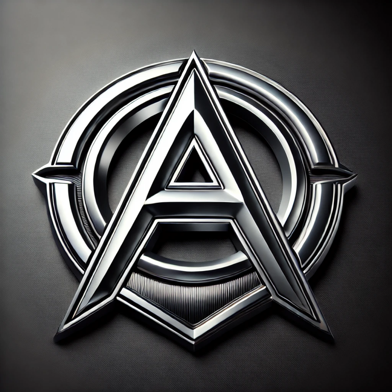
    In this weeks, blog, post and creative exercise I decided on doing an activity that I found in a book from class called  Caffeine for the Creative Mind by  Stefan Mumaw and Wendy Lee Oldfield. The creative exercise was called, Don’t Put This on Your Hood Though. For this exercise you must create a car emblem for yourself. It can have something to do with your name, your initials, or a nickname or anything that says who you are. The only catch is to remember that it has to look cool in chrome.


Thought’s

    Now my first thoughts going into this exercise was that every car manufacturer has an emblem most times on the front and back of the vehicle or even in the center of the car wheels. So I thought to myself how do those different type of car manufacturers emblems look? How will I create mine to be different. We all know that BMW has a circle with white and blue quadrants on it and Ford has a blue oval with their name written and script inside it. 


Challenges 

    The first challenge that I encountered in this exercise was how was I going to incorporate colors, shapes or even text in my design? What will it say if I did use text? I first started with my sketch book and tried a few different approaches including shapes and incorporating colors and text. 


Success 

    Finally I decided to create an emblem with text because I thought that it personally would look better in chrome if it was just as simple as a letter or two. I also decided to include some shape into my emblem, to mask the letter text  and give it some type of background. When I
decided on my font I wanted to make sure it was clear and bold so that it could be seen and recognized from a distance. I had a lot of fun with this creative exercise, it even had me looking at the different emblems out in the world from different cars as I would be out doing my daily routine. 


Sunday, September 8, 2024

Design Blog Post 1

    Hello there everyone for this week’s Design Blog I want to talk about what I’ve learned in graphic design so far. That being said I have no design background and had no understanding of what graphic design was in the first place. 

  The first thing I learned was that graphic design is all around us, we see it everyday everywhere in today’s society. It took me to pay just a little attention to actually see that graphic design is used in everything from the time you wake up, if the first thing you do is check your phone or bush your teeth. The design on that toothpaste tube was created by a designer. On our phones graphic design is found everywhere from advertisements, digital design, print on magazines to branding logos on most of our favorite clothing. 

    Graphic design “is a professional visual arts discipline, a form of visual communication used to convey a message or information to an audience, to make editorial content, readable, and accessible, or to affect people”.  After reading this I just thought to myself how graphic design really does impact us in today’s society how much influence it gives us from something as simple as a photo advertisement of our favorite movies or music album cover. 


   I personally feel like I have learned a lot this week and now know that there is a long road ahead of continuous learning and experience. Especially after creating and designing our first ever project business card. Thinking back on all the challenges and successes we have had this week from our first drafts to our final drafts. I am eager to learn more about this new world design that has been introduced to me in the upcoming months. 


Saturday, September 7, 2024

Creativity Blog Post 1


      In this weeks, blog post and creative exercise I decided on doing an activity that I found in a book from class called  Caffeine for the Creative Mind by  (Stefan Mumaw and Wendy Lee Oldfield). The creative exercise was called, How do I get ink off my desk again?  For this exercise you take out some sketch paper and find an object in your surrounding, it could be something small or large around the room. Now, once you have that object in your view, you are going to draw that object on your sketch paper but with a catch. You cannot look at the paper until you are finished drawing you are solely  allowed to look at the object until finished with the drawing. You can lift up on the pencil so that it does not have to be with one single stroke of the pencil. 

Thought’s

        Now my first thoughts going into this exercise was one of many thoughts people may have and that is “I can’t draw”. I began doubting myself on how I can create something artistic without looking when while looking I wasn’t sure of myself either. 


Challenges 

       The first challenge that I encountered in this exercise was the simple fact that I am not an expert in the artistic field. I began looking around the room debating on what to draw. When I put thought into it, it seemed that everything was impossible to draw especially when not looking. Eventually, I came to decision and picked a portrait of some flowers hung in my room. People say all the time they can’t draw but in actuality they can it’s as simple as putting a pencil or pen to a piece of paper.

Success 

    When I looked down at my paper I was surprised to see that I can in fact draw. I made out all of the flowers in the image. I was drawing freely without a thought behind the strokes of my pen. I found that without second-guessing myself and letting my mind room free and just simply looking at the image and making it out with my hand, I allowed my brain to blossom with creativity. Finally, I realize that being creative has no limits. Exploring our creativity can boost our confidence. Something as simple as this exercise fueled me with confidence I didn’t know I had. 

Recreating Movie Poster

  Recreating my horror movie poster gave me the opportunity to experiment deeply with color theory, emotional tone, visual structure, and sy...